spoon

Recent Recipes

Assignment 2: Semiotic and Communication; A Case Study

Comments (0) | Wednesday, September 7, 2011

Semiotic and Communication; A Case Study


First, there are few texts in the ad which are the slogan, “white, black, yellow on the image of three different hearts and the “United Colors of Benetton”. From the texts, the intended audience is known that the ad is targeted on people who are in racist. This is because the ad is giving out a connotative message of racism integration. As we can see the text of white, black and yellow are on the separated heart and the heart actually is a symbol that signifies the meaning of we are all the same, as the function and the colour of hearts are also the same. For the sentences of “United Colors of Benetton” actually signifies the meaning of all the colors from the world. Therefore, the ad can be an index as the ad represents the information of motivation to live together under a united network.


The ad actually is a “Anti Racism Campaign” that let us to believe that even human are different skin colours in different cultures, but together we are all human being with the same intention to live better in their life and tolerance to each other like how the three different hearts can be put together in this ad without any damage. Some of the background information is important to read this print ad text such as the knowledge of the brand, United Colors of Benetton. This brand is a globally recognized clothing label, they are expertise in building brand awareness through controversial print advertisements that cantered on the colors of the world and the ideas of difference, reality, freedom of speech, and the right to express it. 


            Reality about different races from all over the world is constructed through the text by showing three hearts but label as in three different colours, which is in white, black, and yellow. From the point of semiotic, the denotation of heart is an essential living organ which is important for us human to survive. As for the connotation, each of the heart with the label is a symbol of the three major races based on the three different skin colours. White skin refers to Caucasian or European; black skin refers to African; and yellow skin refers to Asian. To be more specific, this ad message is trying to say that even though we have different skin colours, but we as a human have this similarity which all of us need heart for our survival; and most importantly our heart is the same in colour. This means we are not that different after all.


            At the very first look at White, Black & Yellow which stated in the image on these hearts, the people from the western courtiers will generate the image in their mind of the three skin colours in their country. They will have the image of although we may be different from outside, but in our heart we are still the same, in other words different race work together for a better future.


            However, there might have different point of view to the Malaysian. Those who are illiterate or do not like the western countries will find this image is racist in their mind. Yellow is referring to Chinese, and Black may refer to Indian and Malay. Some Malaysian may find it uncomfortable being mentioned their skin colour, some may not prefer being mentioned by their race. Besides that, through the united colors of Benetton’s ad, the ad written with “United colors of Benetton” does convey us the message of unity. The three hearts are being put together apparently show that they are from the human’s heart which brings out the message of one heart.


There are words written on the three hearts with white, black and yellow on each heart respectively. These do metaphor the difference between the skin colors of people. From the ad, it indirectly shows out the different skin colours of peoples’ heart instead of showing their human figure. The usage of metaphor here does using the heart as a sign in semiotic to represent the people. The ad is trying to promote a global luxury fashion brand which is suitable wear by all different layers of people regardless their skin colour or age. The reason I said so is due to Benetton’s variety of clothing for women wear, men wear, children wear and underwear. Besides, they do expand into toiletries, perfumes, and items for the home such as kitchen accessories and baby products. Therefore, in order to send out the message of their variety via advertisement, Benetton is using the pictures of three different skin colours of peoples’ heart to let the public know their main purpose and intention for.


            Benetton’s products in its advertisement, they have chosen to show images related to important world issues in an apparent attempt to raise awareness. It has a unique form in advertising their brand. It is unlike other brands of clothing. Its campaigns are not about the clothes but more to social problem such as racism. This kind of ads is intended to grab the attention of people automatically. It allows the people to think on the topic and this might insist people to take a necessary action towards the issue. In addition, they give us a message through our art and creations regardless the colours, races or bodies. It also emphasizes that although we all look the same from the physical part, but our hearts are the same at all time.


            In this ad, it conveys us a message across through our art and creations. The message also across to the cultures they respect among human being and make clothes for everyone. This is because it is a part of the human's right. We need to respect others if we want to make some changes to our world, that's one of the initial steps. Benetton brings the concept of we group our behaviour together in our society.  In my opinion, racism is a self learned behaviour due to the fact that nobody should be discriminated against their skin colours. 


Lim Yan Shan - 1101108871
Lim Mei Shan - 1101107963
Wong Shu Ping - 1101108901
Soh Jian Yuan - 1091104099
Gan Siew Kee - 1092700779


Read More......

Assignment 1: Semiotic Analysis

Comments (0) | Wednesday, August 10, 2011

Semiotic Analysis


First of all, based on the sentences in the advertisement “We are all dedicated to serve Malaysian better”, the intended audience is directed to all Malaysian. The 1Malaysia Digi print ad had successfully conveyed the intended message on how peaceful we are living in Malaysia, even though we are different in racial, religions and cultures or even other Telco in Malaysia. This means that even we had the differences among others, but we all are still Malaysian. By looking at the image of the print ad, blue bear icon signified as Celcom, glob icon hugged by yellow man signified as Maxis and the yellow man icon signified as Digi itself. When comes to connotation, the three Telco in Malaysia are signified as our three main races in Malaysia.

The cultural assumptions or codes called upon to read this text are the racial differences. The ads want us to believe that every race holds different values, but together we are all Malaysian with the same intention of building a better nation just like no matter how different the three Telco in Malaysia in offering their services and products but they are trying their best to serve us better.

Some of the background information is important to read this print ad text such as the knowledge of Malaysia history. Without the knowledge of Malaysia history, we would not even know what Malaysia day is and how its independency being achieved. That particular day is the public holiday that the whole nation celebrates together. Other than that, audiences who see this ad have to hold a certain understanding on the demographic value of the country. Our country is a multi-racial country which makes us so unique, and yet we have three major races, which consist of Malay, Chinese and India. This is why the print ad state that “we may have our differences”, because we have different skin colors, different spoken languages or dialects, and different cultures.

Besides, these three major races are represented by the three famous icons which are the mascot of Digi, Maxis and Celcom respectively. Furthermore, the text of this ad has constructs a realistic view of the country by saying “but we are also the same”. It is true that we have our differences by just looking at it. Although we came from different communities and background but we are also the same since all of us are the human beings living in the same mother Earth. Reality is constructed through the text and this is how we, Malaysian live in this harmony country under the same roof. We are all equal and we are also “1Malaysia”. The number "1" has played the role as a symbol on the top right corner of the ad showing that, together we are actually as a whole in unity rather than a different individual.

Other than that, the text in this ads, “We may have our differences, but we’re also the same.” is referring to the three telecommunication companies. Together with the icon of these three companies’, most people will get the idea of “It's Malaysia Day, they want to have peace.” However, for Malaysian this sentence have a different point of view. The alternate reading for the text of the ad for Malaysian, the “We” also refer to the three main races in Malaysia which is Malay, Chinese, and Indian. This is because the image in the ad, the “yellow man” hugging the others signifies in a way that the three races are hugging together and living in peace.

In addition, it also do mean although we are from three different races, we are still the same. The “same” is referring to we are Malaysian. It is an excellent advertisement created by Digi to wish everyone Happy Malaysia Day at the same time supporting 1Malaysia campaign. Nonetheless, the second sentence of the text which is “We’re dedicated to serving Malaysian better.” The original meaning was these 3 telecommunication companies together will provide Malaysian better service, while the alternate meaning of this text is three races work together to make Malaysia a better country.

Furthermore, the ads written with “we may have our differences, but we’re also the same” does convey us the message of unity. Digi famous Yellow Coverage Fellow are seen being together and nice with Celcom Blue Bear and Maxis globe logo apparently shows that although they are from different local Telco, but they do together, work hard and serve our Malaysian better. Besides that, the different local Telco delivers the message of metaphor that the different ethnic in Malaysia which consist of Malay, Chinese, and India. The metaphor is being used to promote each of their Telco. Meanwhile, 1Malaysian concept is promoted in order to unite the people from different races as they are living in a one big family in Malaysia.

This is quite an interesting print ad where the concept of 1Malaysia is introduced to the Malaysian to build ethnic harmony, national unity and efficient governance. As we all know, what makes Malaysia unique is the diversity of our fellow citizens. 1Malaysia is intended to preserve and enhance this unity in diversity which has always been our peoples’ strength and remain their best hope for the future. However, the 1Malaysia concept reach out to Malaysian despite of their differences,.They share a desire for an opportunity, respect, friendship and understanding for a better tomorrow.

In this advertisement, we can get to know that we may have our differences, but we are also the same. This 1Malaysia Digi Printed Ads has created a twist that is living in Malaysia peacefully together with other Telco in Malaysia. It brings the message of culture in Malaysia which draws on the different cultures of the different people in Malaysia. 1Malaysia is not a new concept, it is apparent because it is the latest in a whole series of ideas and visions which seek to promote unity among our diverse communities. In this concept, it influences among our people especially students. Students represent our future generations that govern the country and they have a clear message and concept of 1Malaysia. Our future generation should be a generation that loves the country and not betrays the country irrespective of their different religious and racial backgrounds.

My own value through the ad is 1Malaysia values and respects each community and culture in Malaysia and proudly regards them as a benefit. "We may have all come on different ships, but we're in the same boat now". Malaysia can be successful with the unity of people because 1Malaysia highlight the value of multi-racial people and some are more united people. In other word, 1Malaysia concept helps ensuring national aspiration, Wawasan 2020 to be achieved if it is instilled in every Malaysians’ soul and practiced by every Malaysian.


Lim Yan Shan - 1101108871
Lim Mei Shan - 1101107963
Wong Shu Ping - 1101108901
Soh Jian Yuan - 1091104099
Gan Siew Kee - 1092700779


Read More......

week 6-Understanding still images

Comments (3) | Wednesday, July 27, 2011

For this week, our task is to choose an advertisement and discuss about it. So I choose a creative campaign advertisement from Zaini( a chocolate brand).

Agency: Leo Burnett, Milan
Executive Creative Director: Enrico Dorizza, Sergio Rodriguez
Art Director: Milos Obradovic
Copywriter: Andrea Rosagni
Illustration: Studio Ros
Photography: Studio Ros

Love the advertisement that express in a cute and funny method.


Their tagline, “Kofli, chocolate with coffee inside.”

1. Who are the communicators?

The communicators of this advertisement is Zaini. They hires the advertising agency(Leo Burnett) to creates this advertisement and send their message to the public through a creative advertisement hoping that it can grab the public attention and attract people to buy it.

2. What product or service is being advertised?

The product being advertise is a chocolate brand by Zaini. They use cute animal character with a huge popping eye to advertise their product, with the tagline below “Kofli, chocolate with coffee inside” in order to give more information about the product-which means there is surprise in the chocolate.

3. What are the demographic and psycho graphic characteristics of the audience at which the advertisement is aimed?

This kind of advertisement can be publish in many kind of way. So the range of audience is wide. It mainly targeted to chocolate lover that like coffee too,or perhaps anyone that enjoy chocolate that is mix with other ingredients.

4. Which needs and gratifications are addressed in the advertisement?

The gratifications and needs in this ad might not be very clear.But, this is the way I see and interpret it:The advertisement shown is for those who wanted to have a snack or sweet to wake them up during the boring moment.The clue is the exaggerating popping eye and the tagline below-
“Kofli, chocolate with coffee inside”


5. Do the Non-verbal cues in the picture contribute to the non – verbal message?

Yes, the picture contribute to the non verbal message which with the pictures that show the animals (
(chicken, fish and rabbit) that is made from chocolate eye popped out after they add in the coffee as one of the ingredient.But without the tagline below, it is quite hard for consumer to figure out the message Zaini wish to bring out.


Posted by Lim Yan Shan (1101108871)


Read More......

Week 5: Film Appreciation: Thin Red Line

Comments (3) | Friday, July 15, 2011

The Thin Red Line is a 1998 American war film which tells a fictional story of United States forces during the Battle of Mount Austen in World War II. It portrays men in C Company, and in particular, those soldiers played by Sean Penn, Jim Caviezel, Nick Nolte, and Ben Chaplin.

source : Wikipedia


In every movie, the director had about 10minutes to introduce a few things.
The Main character, The Reason of him in the movie, The Settings.
When? Was it a story talking about the future? Was is about the pass? Or the story is in this century of time. Where? The director trying to let the audience know where is the story happening. Some country on earth? Outer Space?
Why and How about the story line. Why is he the main character or How did the incident happened causing the rest of the story line.


In this movie, The Thin Red Line.the first 10 minutes of the movie, clear can be identify the main character, as well as the Time, Place, etc.
The main character was clearly show because he appear on the screen the most and he was the most out-standing among the rest.
The shots of the calm forest, river scenery and Indigenous peoples's actions told us this happened some rural area on earth.
Slowly it start to tell that the story was relate to World War II, that told us the date of the story.

Posted by Soh Jian Yuan (1091104099)


Read More......

Week 4: Critical reading of characters

Comments (3) | Thursday, July 14, 2011

We came across with characters and deal with the stereotypes they represent and resist when we watched a film. This week, our task is about how we are going to read the characters and the stereotypes they represent and resist can spark critical thinking from the movie "Titanic".


Titanic is a 1997 American epic romance and disaster film directed, written, co-produced, and co-edited by James Cameron. A fictionalized account of the sinking of the RMS Titanic, it stars Leonardo DiCaprio as Jack Dawson and Kate Winslet as Rose DeWitt Bukater, members of different social classes who fall in love aboard the ship during its ill-fated maiden voyage.

(Reference from Wikipedia)


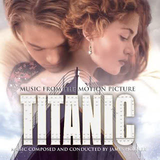
1.Who are Jack Dawson and Rose Dewitt Bukater?


Jack Dawson portrays as a poor, penniless artist who has won the ticket with his friend in a poker game and travels as a third class passenger in the RMS Titanic.


Meanwhile. Rose Dewitt Bukater is a 17-year-old pretty girl, who is being forced into an engagement with Ruth by her mother which can maintain their high-class status after her father’s death. She boards the RMS Titanic as a first-class passenger.


2.What stereotypes do Jack and Rose represent?


As for Jack Dawson, he portrays as a poor young man by carrying an old rucksack when the time he was to board onto the RMS Titanic with his friend. Besides, this could also be shown by the drawing material, the charcoal and plain papers. We can also tell that he is poor by the costumes he wears, which is always over-sized and loose.


On the other hand, Rose Dewitt Bukater, who represents the rich, upper class lady through her costumes and accessories which is always in elegance look. Furthermore, this also can be shown while the time she is sorting out her collections of paintings by “Picasso” while she's in the "Millionaire Suite".


3. Is he and she good or bad?


Both characters are considered as protagonist (except the part where Jack already knew Rose was engaged and still tries to get in between Rose and her fiancé.)


4. What complexities do he and she have, if any?


Rose did not respect his fiancé and did not tell her fiancé the truth.


5. Back up statements with evidence from the film.


This could be showed from the morning scene where the sun light sparks in to the room where Rose and her fiancé are having breakfast together. She is angry after her fiancé had told her that he knew what has happened at the dock last night. Rose warned her fiancé not to spy on her.

Posted by Gan Siew Kee (1092700779)


Read More......

Week 3 : Effect of semiotic systems on human behavior

Comments (3) | Saturday, July 9, 2011

Do semiotic systems have any effect on human behavior? The answer is Yes!

We can find out that semiotic system in design, advertising or multimedia have the effect on human behavior. A design or an advertising: the image, the sign, the narrative or the myths surrounding us will influence our behavior by way of "codes"

A fashion advertising is designed by insert the photo below. By viewing the photo , we can immediately get to know that the fashion advertising is more on the theme of glamour. This is because that the posture (human behavior) in the photo are can be easily understood by all as a code of femininity.

Woman who want to look glamour in photo, they may posture like the photo below. Therefore sometime fashion advertising do effect human behavior. : )


Here another example of the effect of semiotic systems on human behavior- :


Hand gesture -Thumb up! You can see people show thumb up when they feel good on certain thing. Therefore, thumb up is a sign of good, awesome, perfect ! However, upside down of thumb up will turn into different sign.

*Different countries have different culture which will effect the meaning of thumb up.*


You can just show a thumb up to answer the question which mean "GOOD" when someone ask: "How your exam?"

In the the famous social networking service, Facebook. You will able to see the button below in everywhere of Facebook, like fan page, photo, comment, status.....

They make use of human behavior which is thumb up hand gesture to design a LIKE button. Since thumb up is one of our behavior in daily life, so we can immediately get to know that what the function of the button.

If we were exposed to different signs, our lives be different. For example, another sign which can strongly bring our the meaning of LIKE. Facebook LIKE button may change.

Posted by Wong Shu Ping (1101108901)


Read More......

Week 2: The study of signs and their meanings

Comments (3) |

Pierce had many different types of sign but the 3 most important are:

Indexes
Icons
Symbols


What is INDEXES??

--- In semiotics, a type of sign in which the signifier is physically caused by the signified. An Index is a sign where there is a direct link between the sign and the object. The majority of traffic signs are Index signs as they represent information which relates to a location 


For example::
--- Smoke indicating fire


Where there is smoke, there is fire. Thus the signifier (smoke) is physically caused by the signified (fire).


What is ICONS?? 

--- Icon is an object that represents a theme or an aspect of the character or the like. In the specific context of semiotics, a type of sign, wherein the signifier physically resembles the signified. An icon also be can illustrative or diagrammatic.


For example::
---  A photograph


A photograph (signifier) is a mechanical reproduction of what is photographed (signified).


What is SYMBOLS??

--- A symbol has no logical meaning between it and the object. In semiotics, a type of sign in which the signifier and the signified are connected solely through cultural convention. The signifier is totally arbitrary and conventional.


For example::
---  Alphanumeric character


Every alphanumeric character on a computer keyboard is a symbol, as are those things not specifically alphabetic or numeric: $, %, &, #, @, etc. Unlike indices or icons, the symbols are not signs without an interpreter or "reader."


Posted by Lim Mei Shan (1101107963)


Read More......
Mee Family. Powered by Blogger.